
AssignmentRebrand Boston’s largest public media company.
challengeIn a media environment where content has become dumb, sensational, and automated, we had to get WBUR credit for the craft and integrity of their journalism.
approachEnergize the 75-year-old media company’s image with a crisp, vivid identity and a sharp, funny media campaign.


The brand refresh was launched with a campaign that was stubbornly analog and long-form. This pointedly contrarian approach swam against the cultural tide of ever shorter, ever shallower “content.”


There’s outrage and algorithms. And there’s WBUR.
In a media environment growing ever more sensationalist and shallow, public media was perceived to be staid and boring. But the reality was quite the opposite—WBUR’s journalism is fascinating, human, and made by people at the top of their game.
We needed to give people a reason to give WBUR a second look.
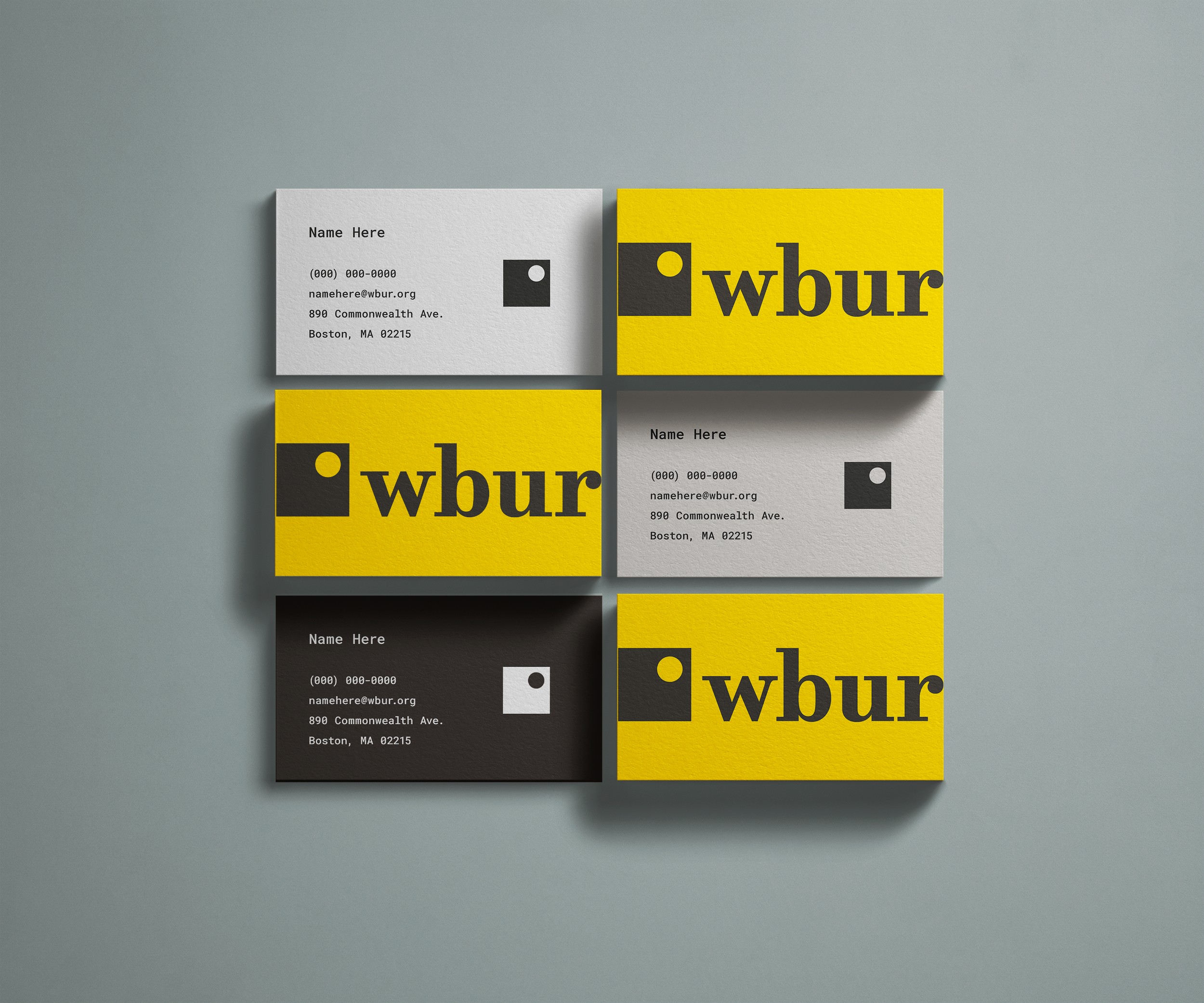
We designed a bold new identity system built around a vivid yellow color and a new icon known as “the viewfinder”—an elegant marriage of a square and a circle representing the rigor of journalism and the art of storytelling.
And to bring the new brand to life, we launched a self-selecting campaign of long copy “minifestos” designed to attract the curious and demonstrate WBUR’s thoughtful approach to journalism. It was rolled out across Boston via transit, guerrilla, OTT, and social.
The work positioned WBUR as an oasis in a media landscape dominated by short-form, sensational content.