AssignmentRebrand a leadership program that supports the women leaders of school systems.
challengeThough “Women” is in the name, the client didn’t want the brand to feel exclusively feminine.
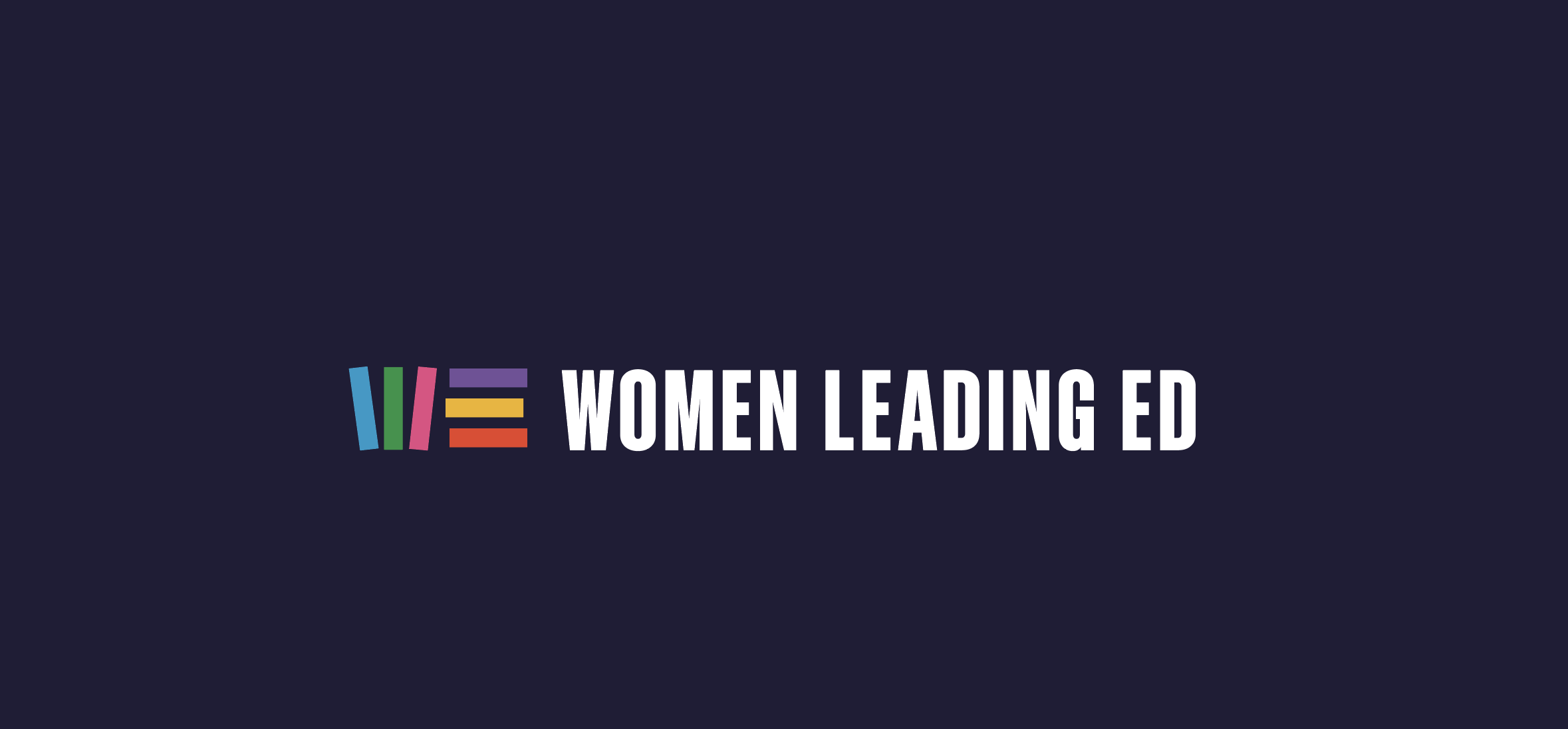
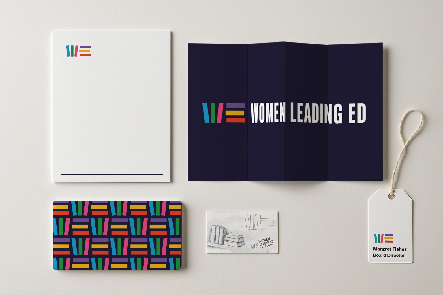
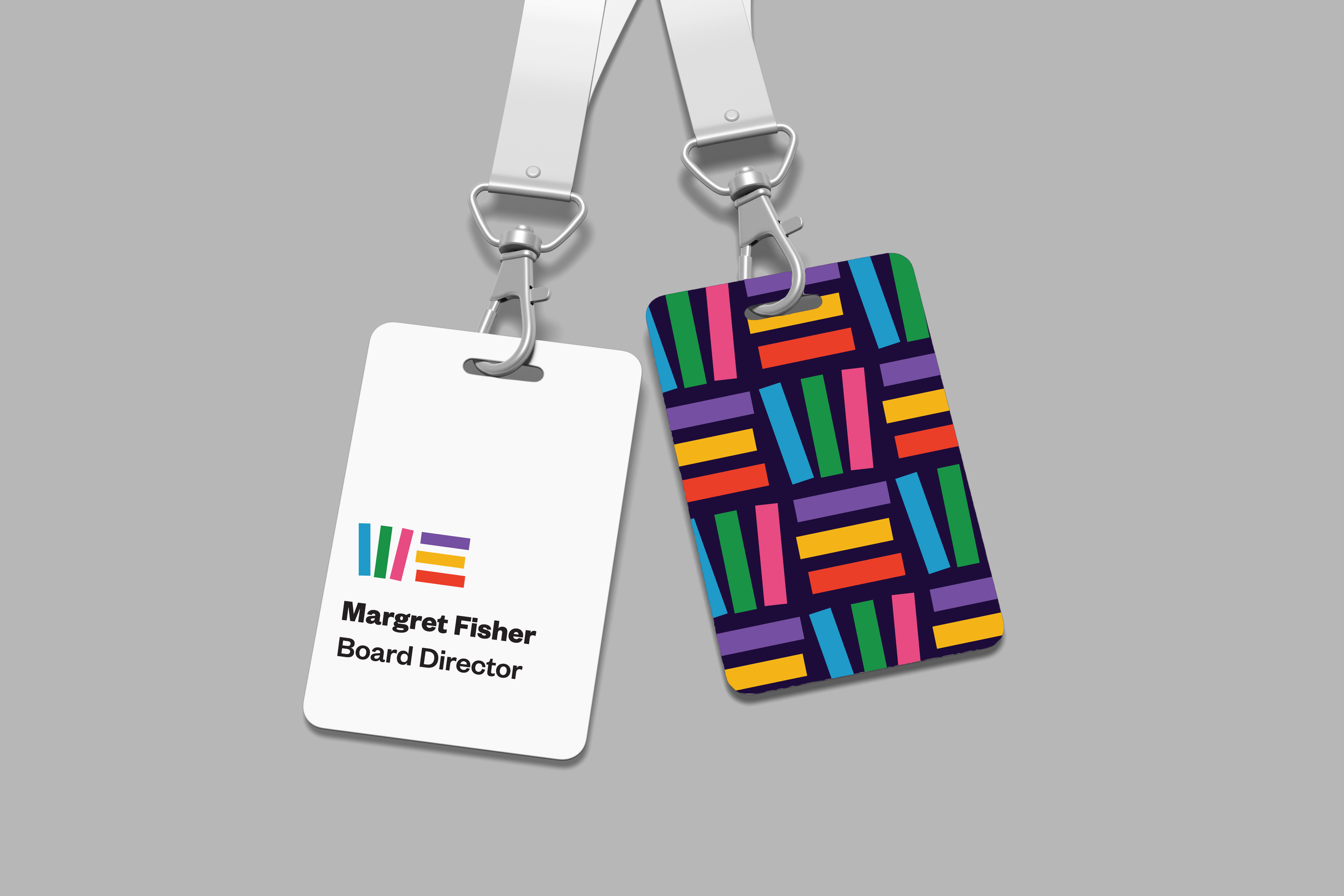
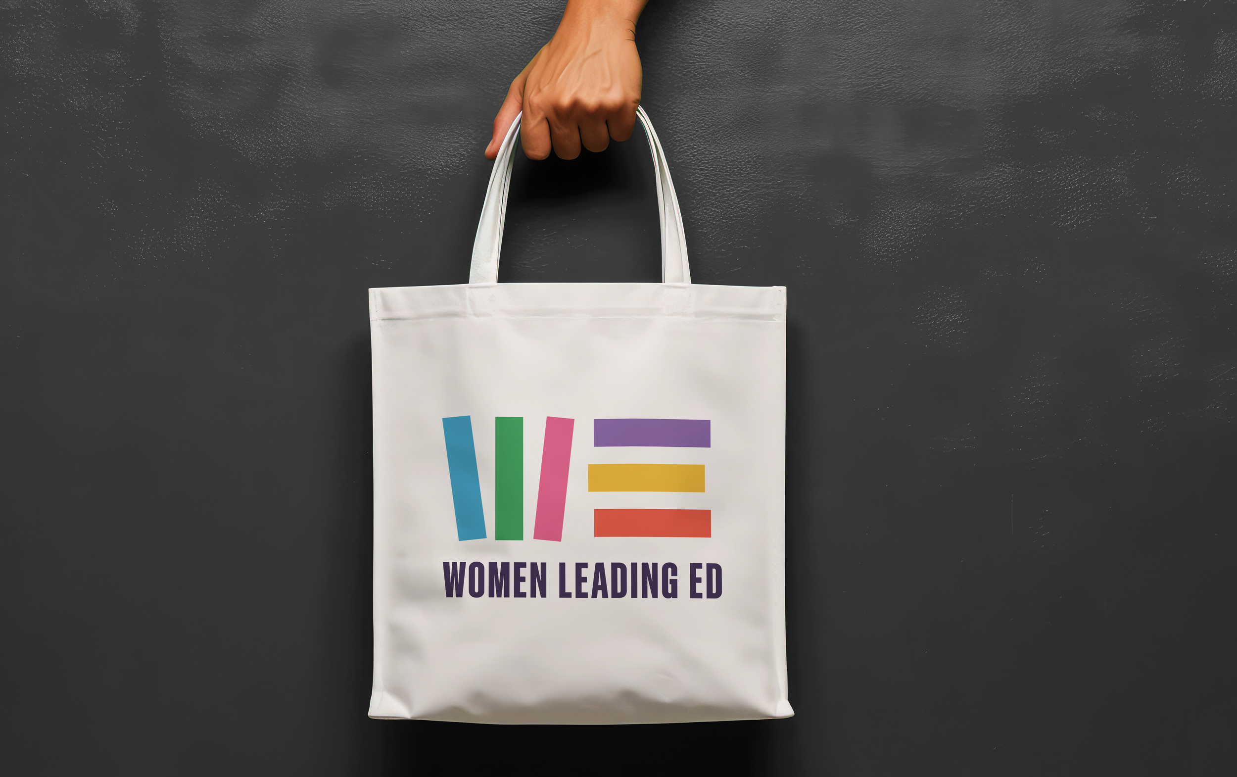
approachUsing books as visual building blocks and a stand-in for education, we created an icon that spells the inclusive word “WE.”


70% of educators are women, while just 30% of superintendents are. For school systems in crisis, that’s a bottleneck for much-needed talent.
Enter Women Leading Ed.
This national network provides mentorship, training, and advocacy for the women already shaping schools from the inside. Their name makes their mission clear, but they wanted their brand to feel welcoming to an audience broader than just women.
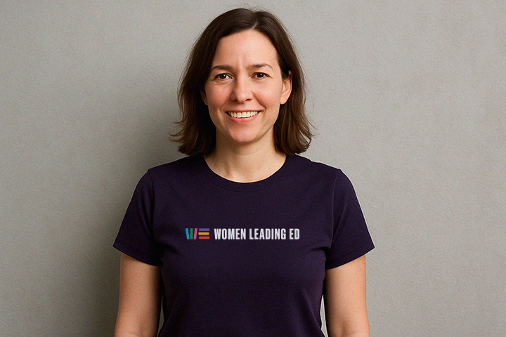
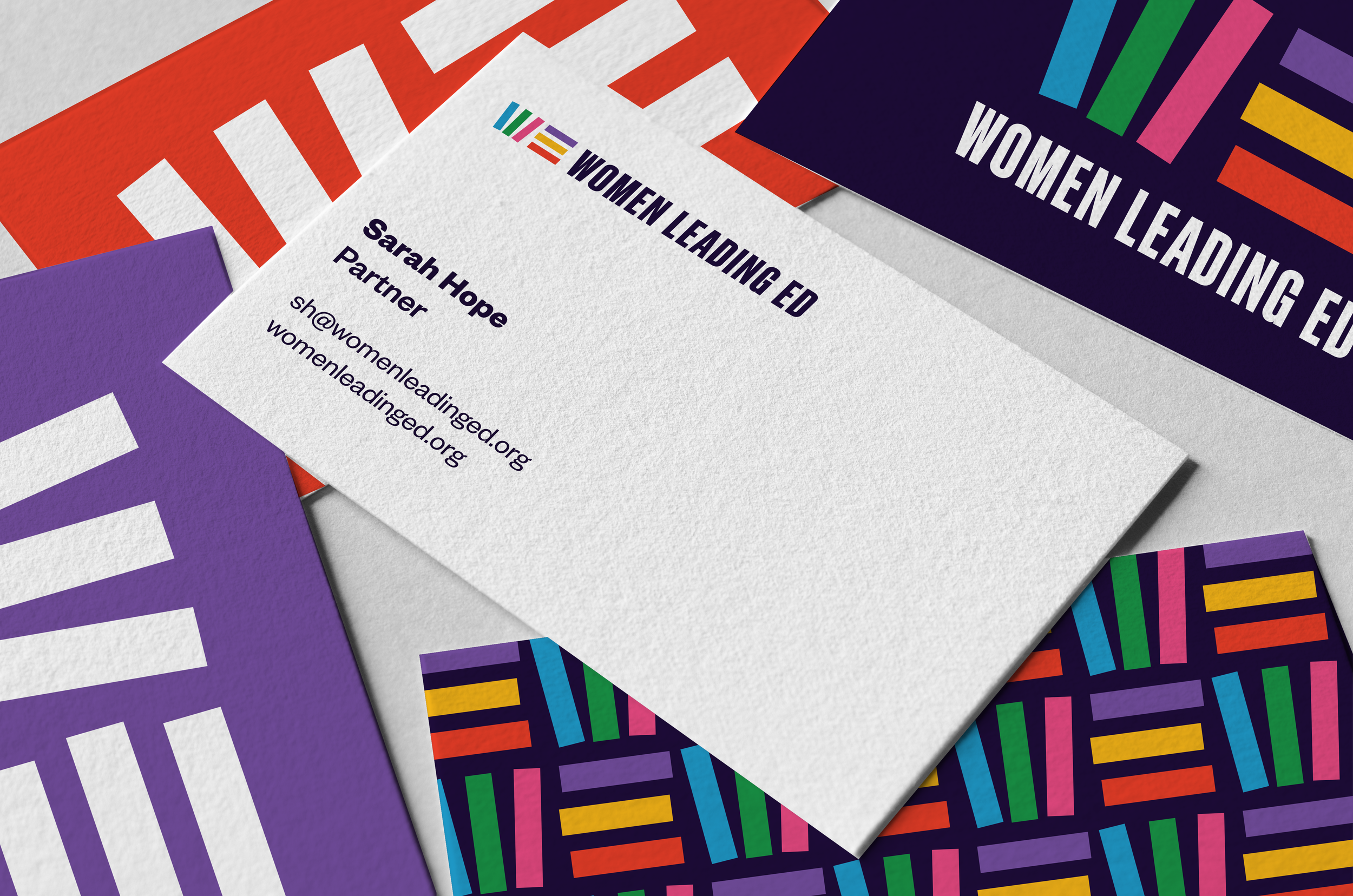
To achieve this, we delivered a bold, typographic identity system using the building blocks of education: books. And we used the most prominent letters from Women Leading Ed’s name to make a symbol spelling the inclusive word “WE.”
It isn’t just about representation. It’s about recognizing overlooked talent and giving it the spotlight and the support it deserves.